The Origin of the Logo
One could look at the House of Mystics logo and think…
“Cool logo, but what does it really mean?”
It wasn’t some random graphic thrown together simply because it looked interesting.
Every element has a reason.
Every shape has a purpose.
And every placement tells part of a much larger story.
Follow me as we take a look back at how it all began.
For the first six years, House of Mystics had no name, and no logo.
It existed as an idea.
A feeling.
An understanding that something was coming.
But what that something would become, what it would look like, what it would be called, and how it would enter the world, was still unknown.
Then, one day, while looking at the symbol of the Deathly Hallows (Hermione is a Harry Potter fan, hence the name), I began to see something.
If we strip away the story of the Deathly Hallows and remove the wand from the center, what remains?
A circle…
contained within a triangle.
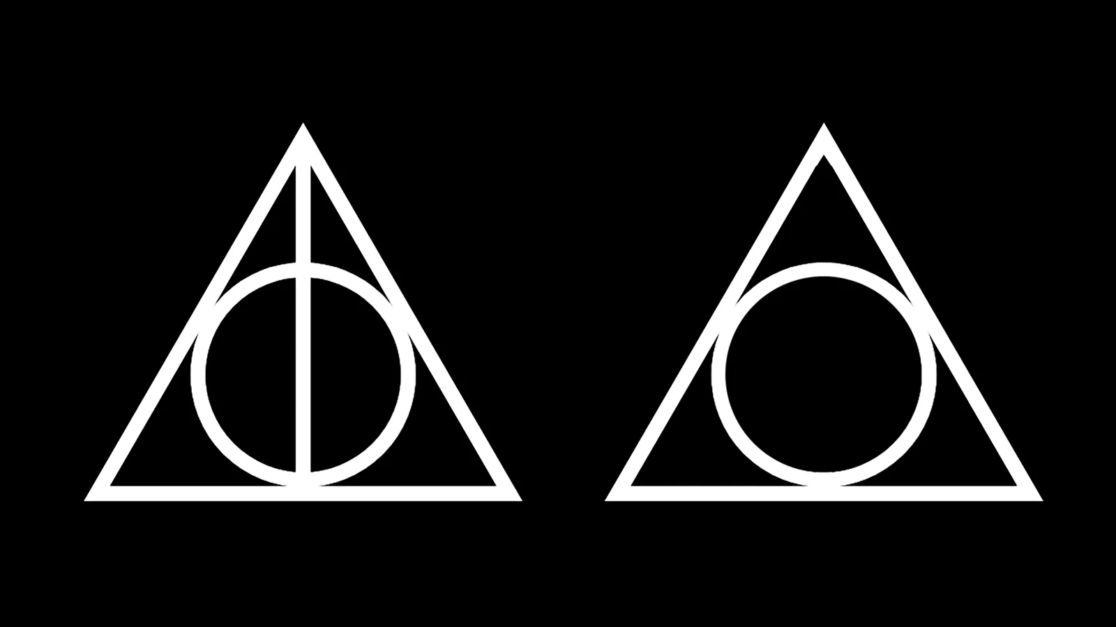
And that simple arrangement of shapes opened the door to everything that followed.
A CIRCLE CONTAINED WITHIN A TRIANGLE
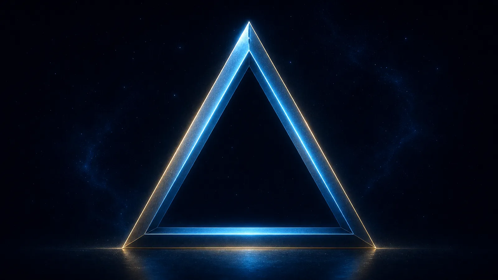
The triangle is the simplest closed shape that can be created.
Two lines cannot contain an area.
But add a third, and suddenly there is form.
A boundary appears.
An inside and an outside are created.
The triangle is also recognized as one of the most stable shapes. We see that stability expressed in architecture, engineering, and in three-dimensional structures such as pyramids.
But add another line to the triangle, and it becomes a square.
Add another, and it becomes a pentagon.
Continue adding sides, and with each addition, the shape begins to look less like a triangle… and more like a circle.
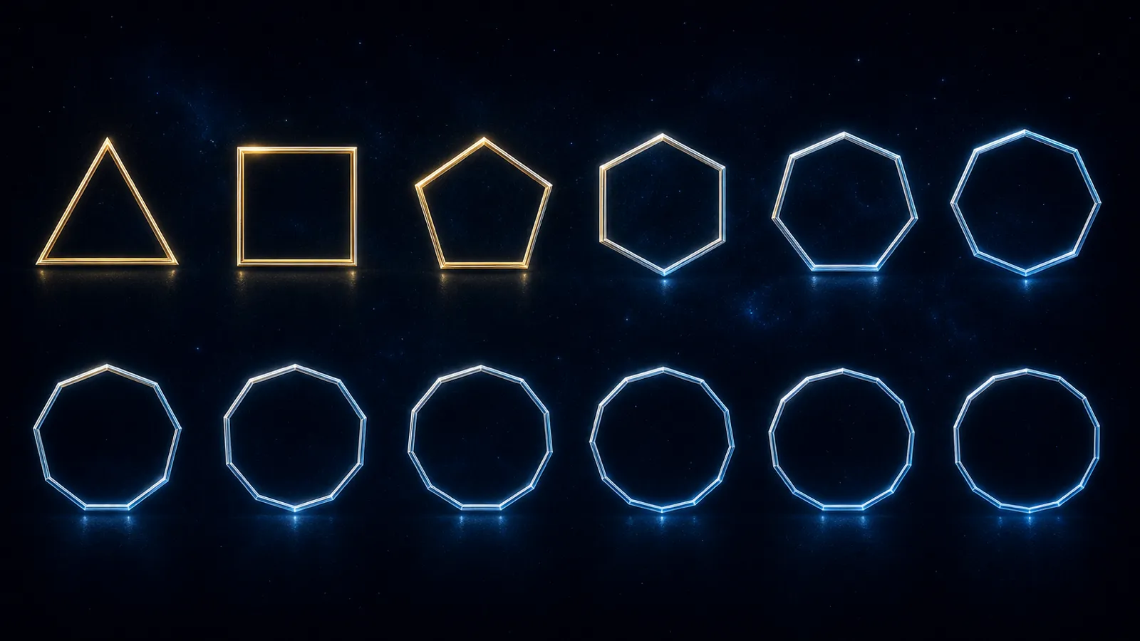
In theory, we could continue adding sides indefinitely.
Eventually, from a distance, the shape would appear perfectly circular. Our eyes would no longer be able to distinguish the individual sides.
But if we moved closer, if we could zoom in far enough, we would discover that the sides were still there.
The lines never truly became curved.
The shape only created the appearance of a curve by using more and more straight lines.
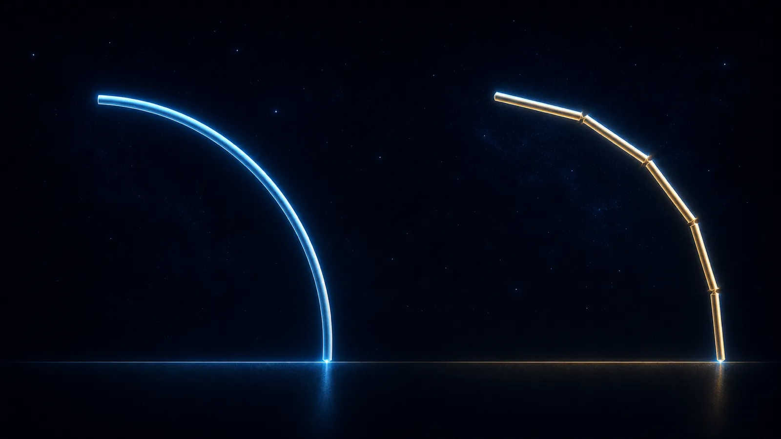
This reveals an important distinction.
The form can move endlessly toward the circle…
but it can never become the circle.
Perfection is not something the form eventually becomes.
It is something the form is already moving within.
And so, the circle became a representation of infinity, something without a beginning, without an end, and without a final boundary.
If form emerges from infinity but can never become infinite, we might expect the form to appear inside the circle.
Contained within infinity.
But that is not what appears in the House of Mystics logo.
Instead, we see the opposite.
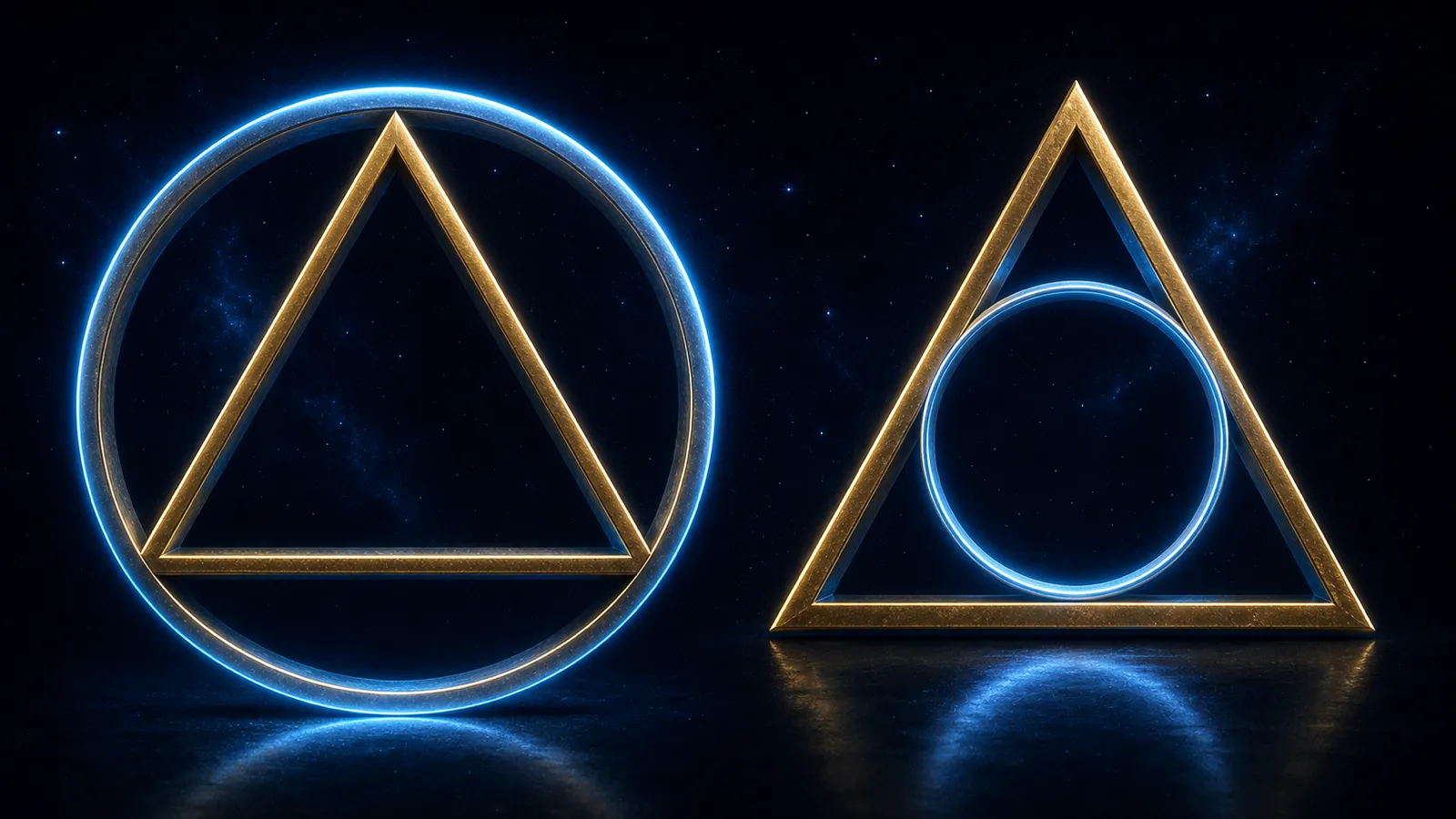
The circle is contained within the triangle.
And to understand why, we have to look at infinity from the perspective of form.
Infinity itself has no form.
It does not divide itself into separate objects or assign meaning to those divisions.
Form does that.
And human consciousness, experiencing existence through form, perceives a world filled with separation and relationship.
“I am this.”
“That is something else.”
“I did this.”
“That happened.”
“And because this happened, something else followed.”
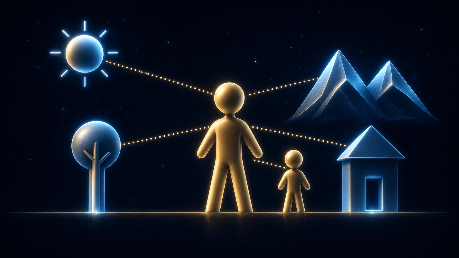
Human consciousness creates connections between itself and everything it experiences.
It interprets.
It organizes.
It names.
It tells stories.
It is the reason we have language and communication.
It is the reason you can look at contrasting shapes arranged across this screen and recognize them as letters…
then words…
then sentences…
and finally, as an idea being carried from one consciousness to another.
But that transmission only works because you, the interpreter, understand the language in a way that resembles how I, the storyteller, understand it.
Perhaps, in that sense, we are a collective field of master storytellers…
a field of experiences, identities, and realities that others can jump to.
But that is another story for another time.
For now, let us return to the logo.
When the circle moves from outside the triangle to inside it, infinity is no longer containing the form.
The form is now containing the idea of infinity.
The triangle represents human consciousness as form.
The circle within it represents that consciousness contemplating infinity, giving an image to something that, by its nature, is formless.
That explains the triangle.
And it explains the circle.
The logo normally uses a three-dimensional expression of the triangle because our human form experiences existence through both space and time.
Occasionally, however, the triangle may appear in its simpler, two-dimensional form.
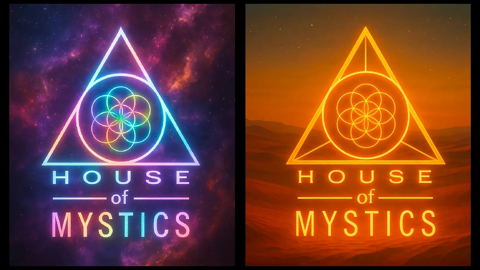
But the circle and triangle were only the beginning.
The image still needed to become a house.
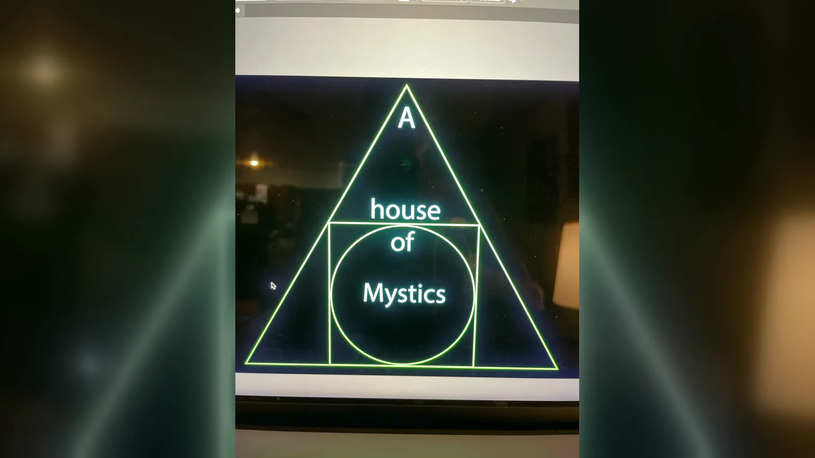
In the very first sketch of the logo, a square appeared within the triangle.
That square represented the idea of a house.
If the triangle represented human consciousness as form, then the house represented something being created within that form:
A cluster.
A group.
A community.
A container.
At the time, it was “A house of Mystics.”
Within that house was the circle, the idea of infinity, representing what the people gathered inside it had chosen to explore.
The meaning of that original design was simple:
Human consciousness creates a container in which like-minded forms can come together and focus their attention on infinity.
That first version lasted only a couple of days.
The design was simplified. The square and the words were removed, leaving the circle within the triangle.
The meaning was still present…
but something was missing.
It no longer felt like a house.
Then I began to look at the triangle differently.
Instead of seeing only a symbol of human consciousness, I began to see the shape of a roof.
And if the triangle could become the roof…
all we needed to do was build the house beneath it.
Then a thought arrived:
“Try to make the words the house.”
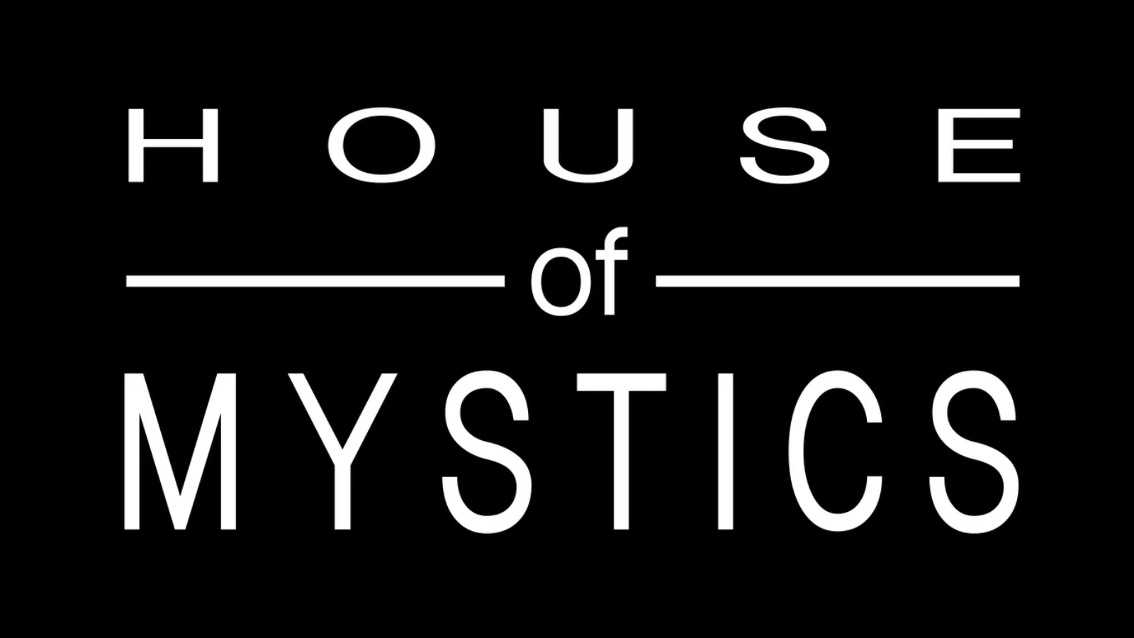
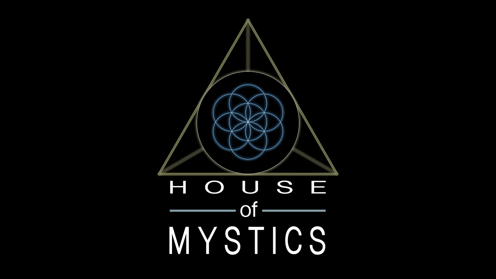
That was the moment when “HOUSE of MYSTICS” found its place beneath the triangle.
It was no longer “A house of Mystics.”
It had become:
“HOUSE of MYSTICS.”
The words were stacked.
Lines were added to the left and right of the word “of,” filling the open space and creating one balanced block.
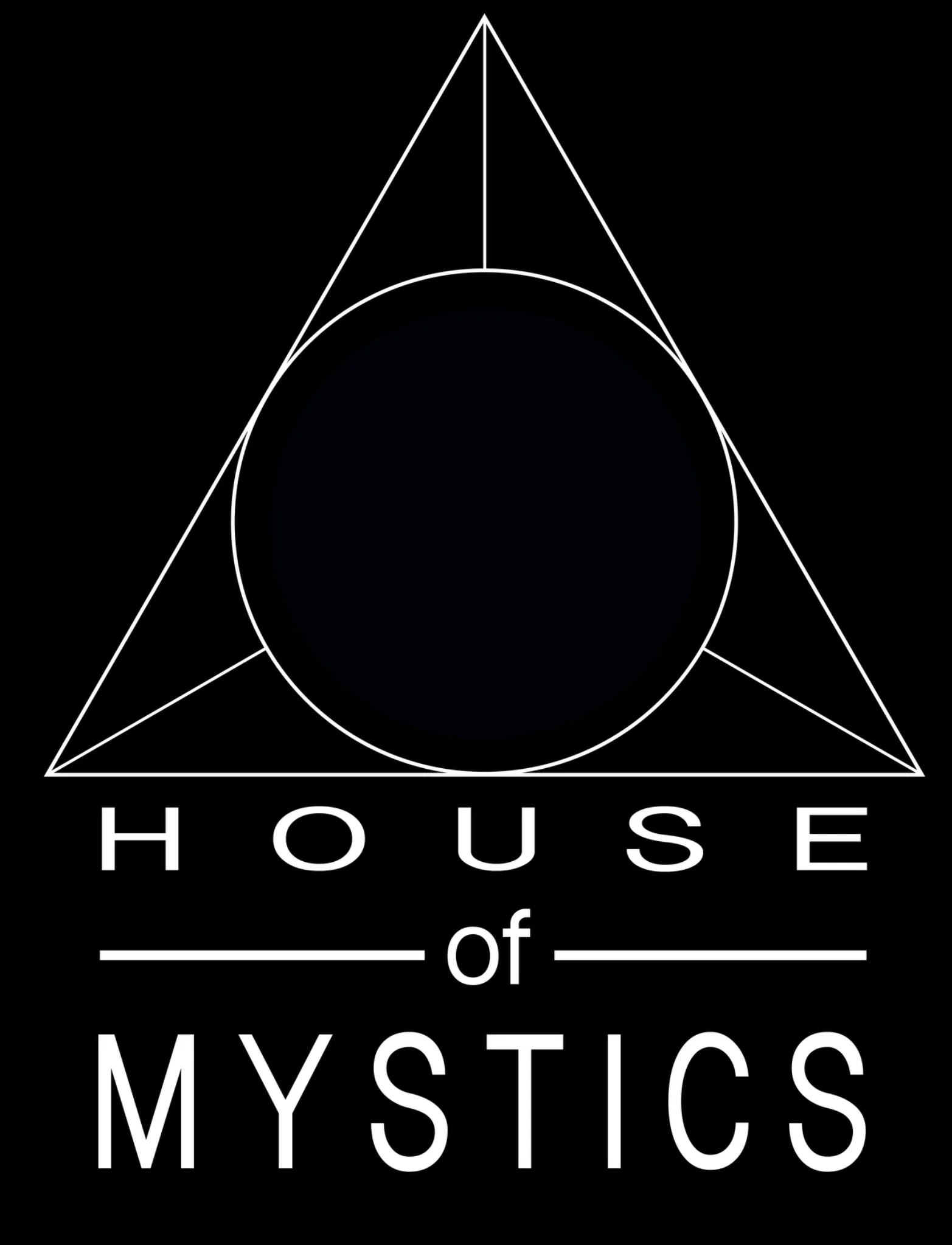
The text itself became the house.
And the triangle became its roof.
The symbol finally had a structure.
But one mystery remained.
What about the pattern at the center of the circle?
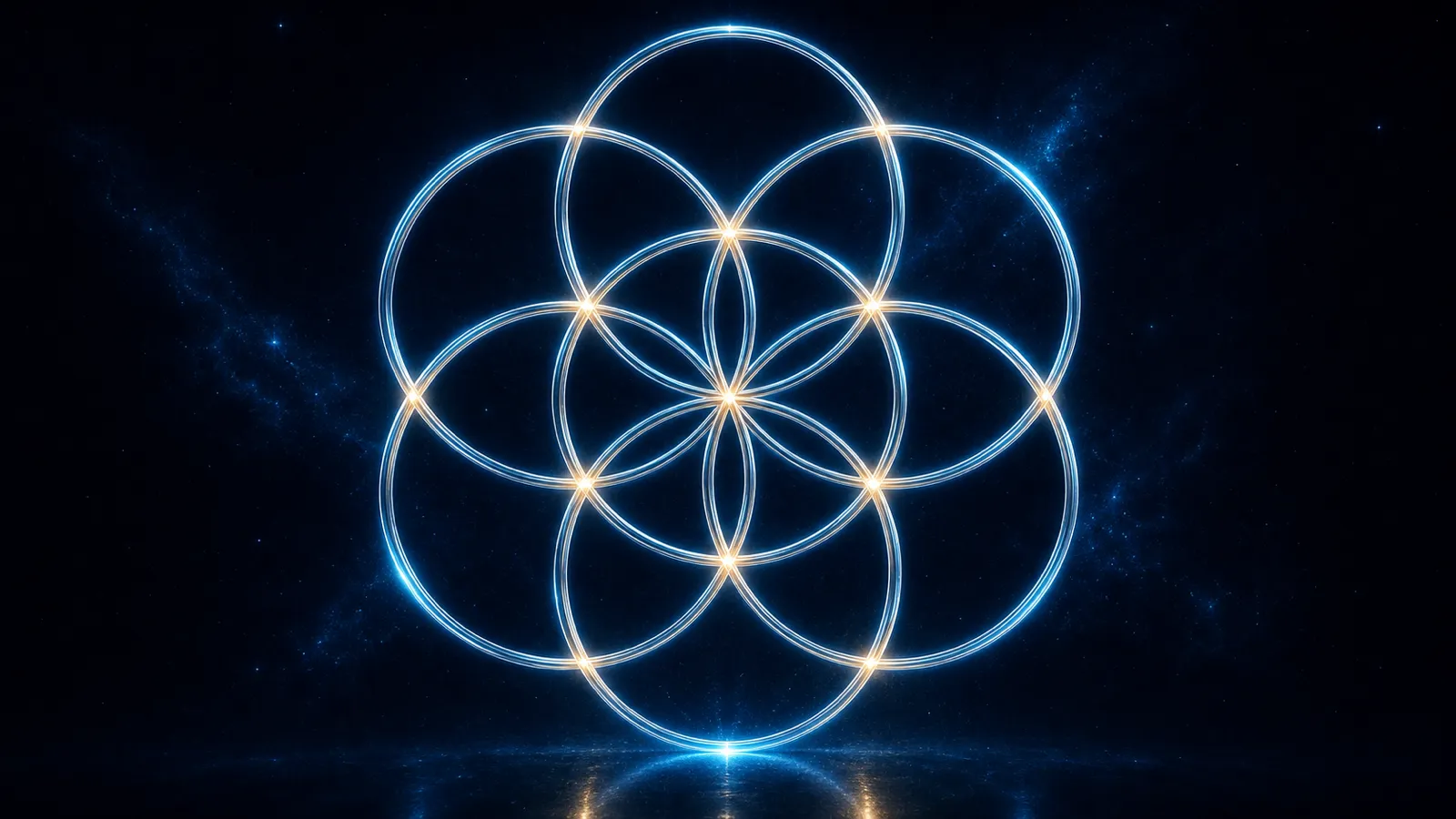
At the center of the House of Mystics logo is an ancient geometric form commonly known as the Seed of Life.
This image carries a long story across many traditions and has also found its way into modern conversations about mathematics, geometry, nature, vibration, and form.
Its full history deserves a multipart exploration of its own.
For now, let us consider it in one particular way.
We already understand the circle as a symbol of infinity.
We understand the triangle as human consciousness expressed through form.
Now imagine that infinity begins to vibrate.
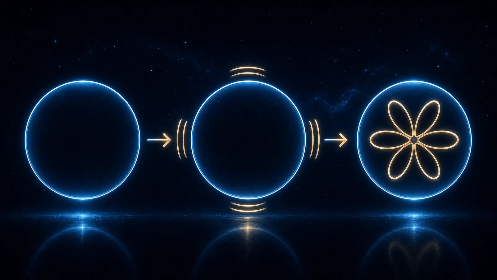
The nature of that vibration determines the form that becomes visible within it.
Bring several circles together, and their relationships begin to produce patterns.
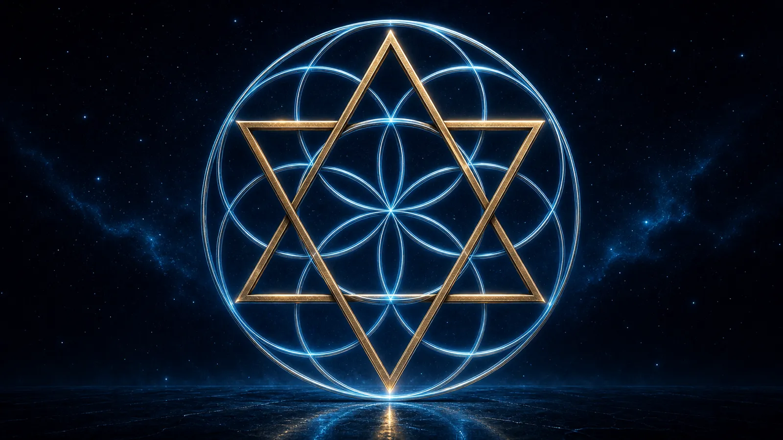
Add more circles, and the pattern continues to grow.
With each repetition, increasingly complex forms become visible, forms that appear to have been hidden within the relationships all along.
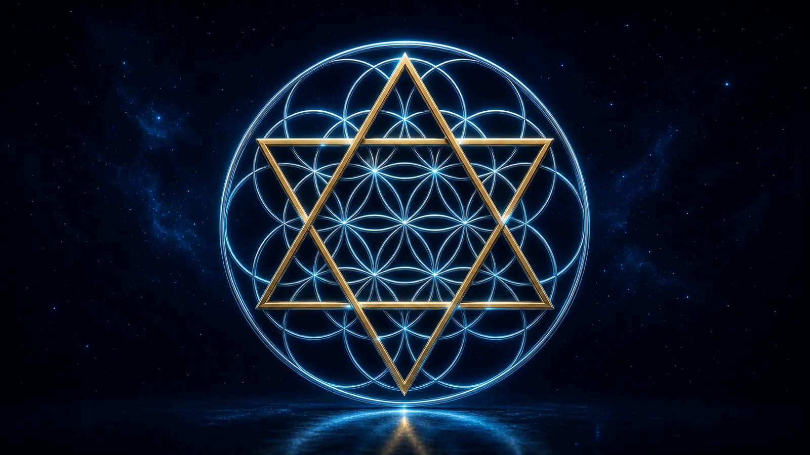
Continue the pattern, and it eventually becomes what is commonly called the Flower of Life.
But the complete flower is not what appears in the House of Mystics logo.
What we see is the form that comes before it.
The seed.
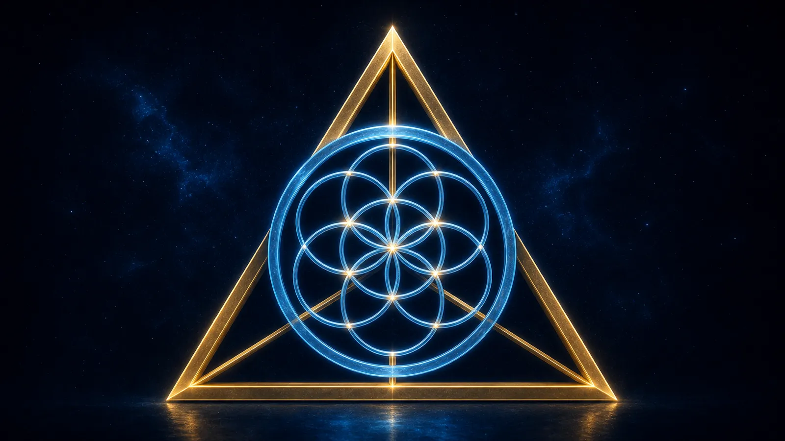
Because before a flower can emerge…
before it can open…
before it can express itself in its completed form…
it must first exist as a seed.
And when every element is brought together, the full story of the logo finally reveals itself.
The triangle is human consciousness.
The circle is the concept of infinity held within that consciousness.
At the center is the seed, an intention waiting to be given form.
And beneath it all is the house:
A group.
A container.
A community.
A collective.
Together, we focus our intentions within this creation…
planting seeds that may one day emerge into their fullest expression…
for the benefit of all life…
in every form…
and beyond.
“We”
“Are”